Brand and Visual Identity
HARGREAVES LANSDOWN
Tasked with reimagining the brand identity of Hargreaves Lansdown (HL), the challenge was to create a bold and unique brand that bought together the companies heritage and it’s vision for the future. A brand that empowers its clients to save and invest with confidence, with a design language that celebrates who they are what they stand for and where they are heading.
To do this I needed a collaborative way of working, putting together a team of specialists from within and outside of the business, which explored what the brand really meant to HL.
We wanted to define not just how the brand looked, but how it behaved. We needed an identity that permeated every touch point and lifted each experience.
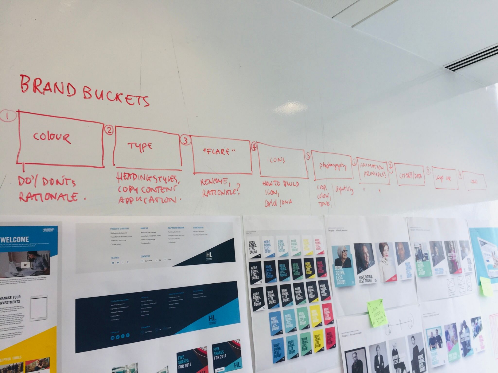
Starting by looking at the brand as a whole, we needed to create a unifying identity, the visual expression of HL’s heritage, values and personality.
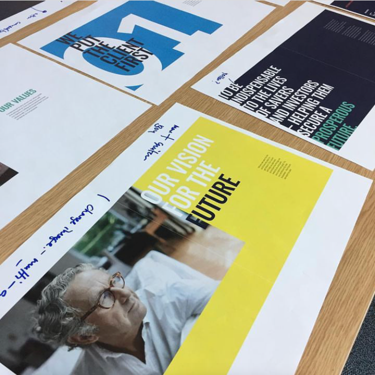
Creating a Purpose, that would inform everything HL does.
Values, it was important to define what HL stood for, the traits the business promotes internally and to clients.
Vision, to inspire action and generate energy.
Personality, to guide HL’s interactions and communications, creating a consistent voice of the business.
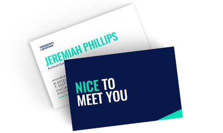
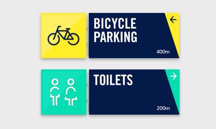
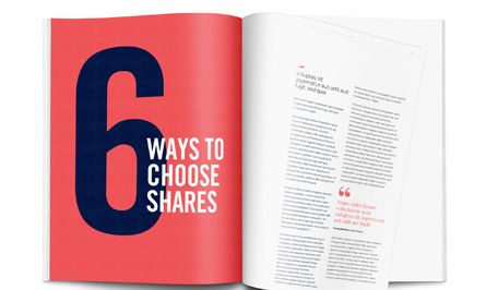
With a clear picture of the brand we then moved into the visual Identity. Influenced by the new brand position we created a complete design system that is strong simple and contemporary. Starting with the logo we delivered a modern and confident confident representation of the business also introducing secondary logo “HL” allowing the business, when appropriate to be less formal with their clients, who had been shortening the company name for years.
From the details within the logo we created the 'Flare', which is symbolic of the brand purpose, bold and directive the 'Flare' illuminates whats important, guiding people through content and highlighting key information, it connects everything the brand touches and is bought to life through the use of colour.
Directly influenced by the iconic hues of Bristol we celebrated the cities status as the UK’s capital of colour, making the pallet as ownable as the logo, whilst reflecting the city and the companies history.
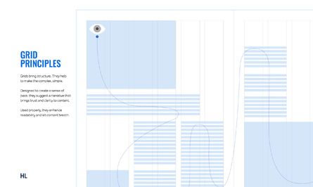
We continued this story telling in our choice of typography, three typefaces give flexibility to the brands personality carefully selected to work together in harmony, each typeface has its own function helping to build a hierarchy of information.
The result is a brand and visual language that for fills Hargreaves Lansdowns purpose.


> WORK
- Creative marketing
- Ux/Ui project development
Get in touch at: oliver.e.ray@gmail.com | About me
